Nordgate
Nordgate helps companies enter and grow across Nordic markets, and connects Nordic businesses with teams in the Balkans. I worked on its website.
- My role
- Website design and frontend
- Areas
- Web design, Frontend, Multilingual, Editorial type
The problem
Market entry is a trust business. The site has to feel calm, local and serious enough that a company would hand over its Nordic expansion, while staying clear about what Nordgate actually does.
What I built
- Website design within a strong blue brand identity
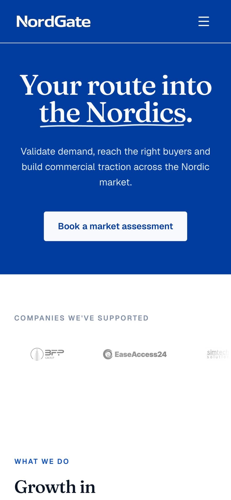
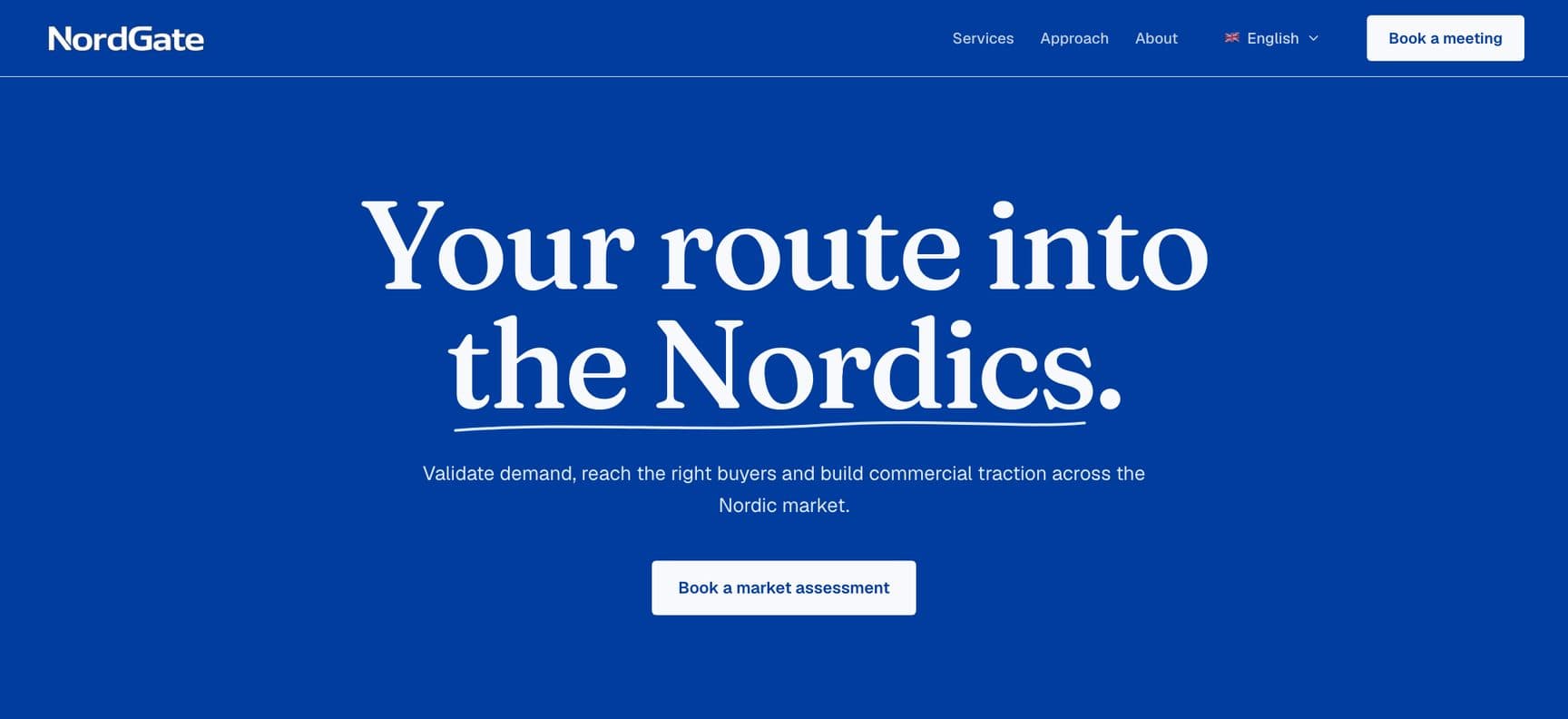
- Editorial serif typography around the line Your route into the Nordics
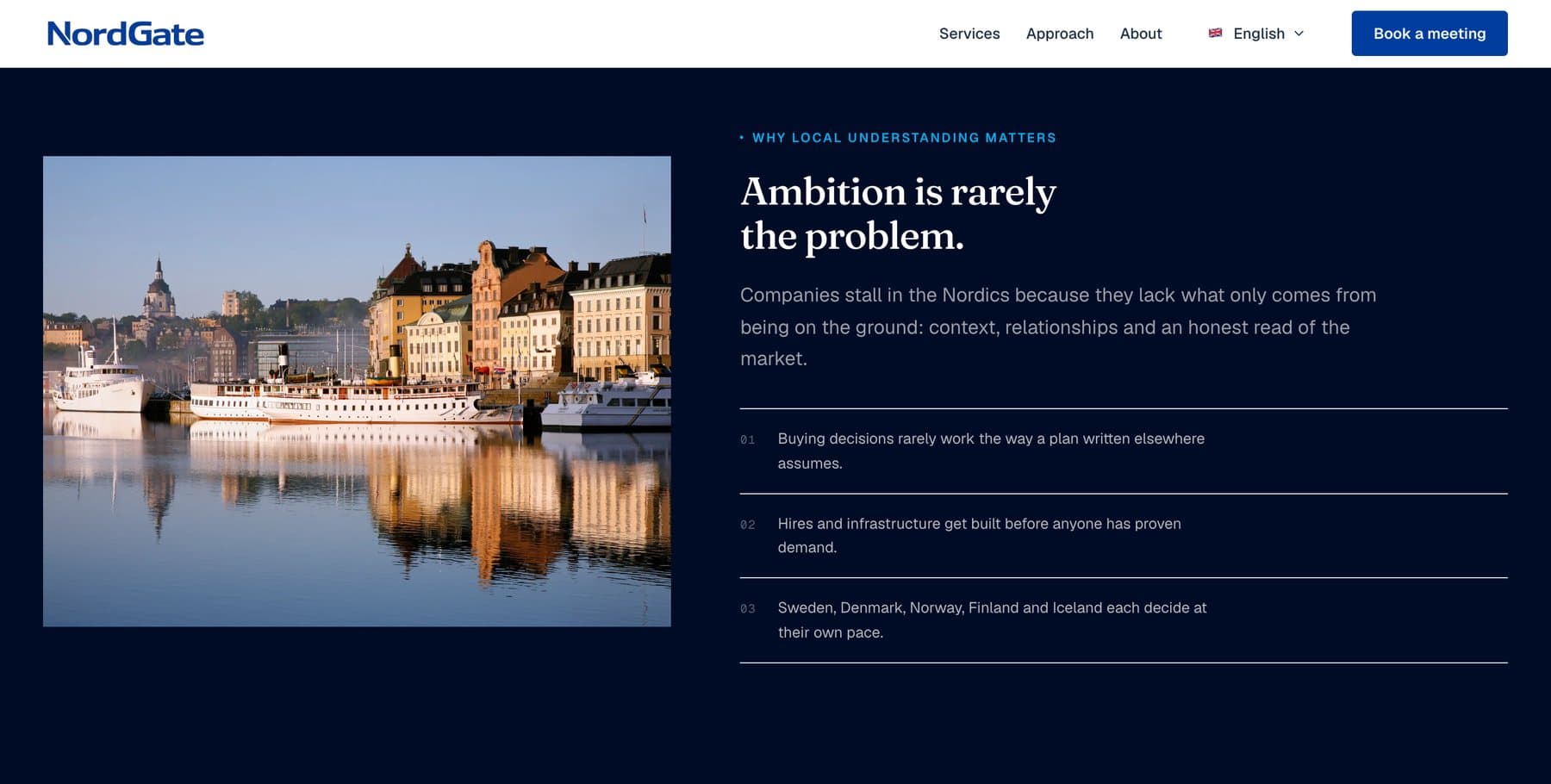
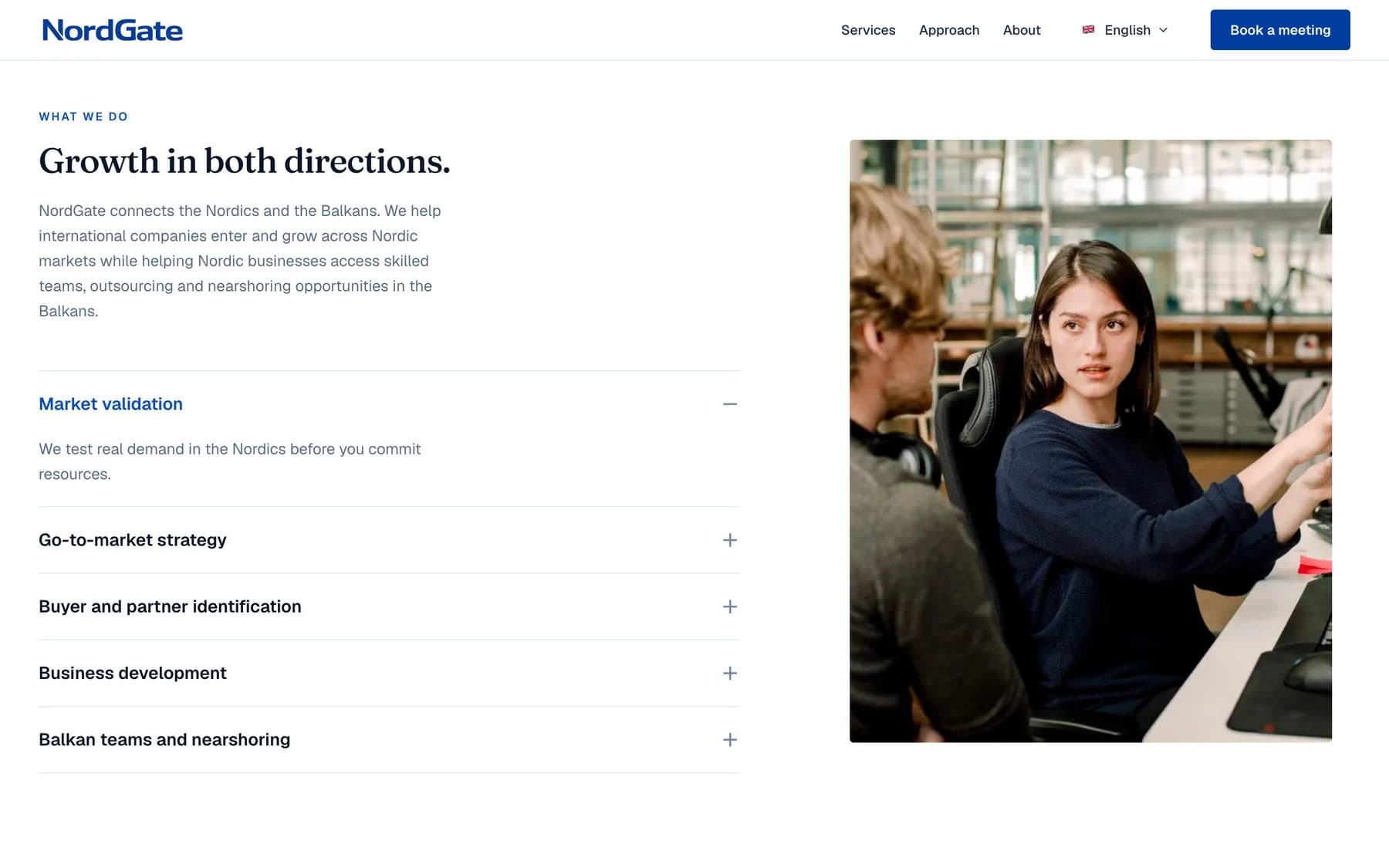
- Photography-led presentation
- Responsive frontend work
- Multilingual structure
Decisions
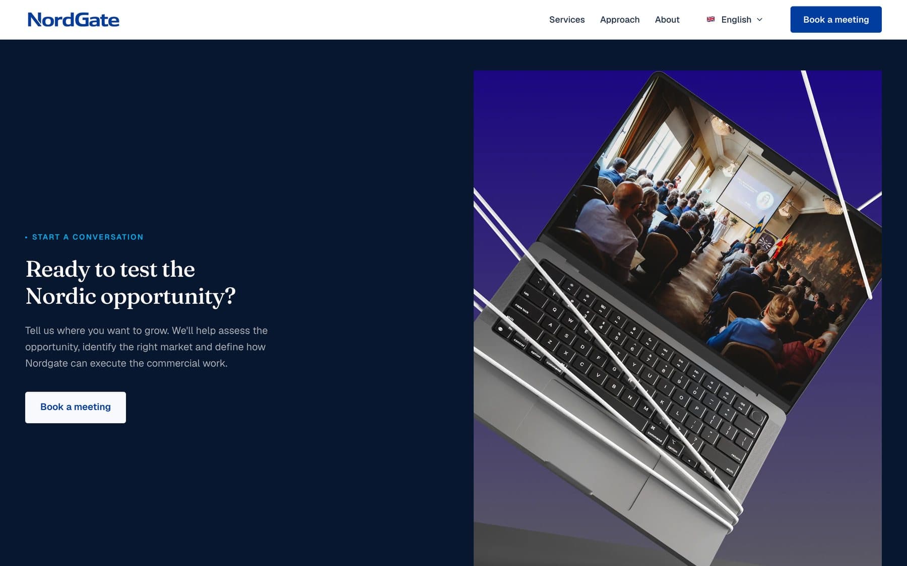
One blue, used with confidence
The brand blue carries whole sections instead of appearing as a timid accent. White serif type on that field does most of the talking.
Serif for the promise, sans for the detail
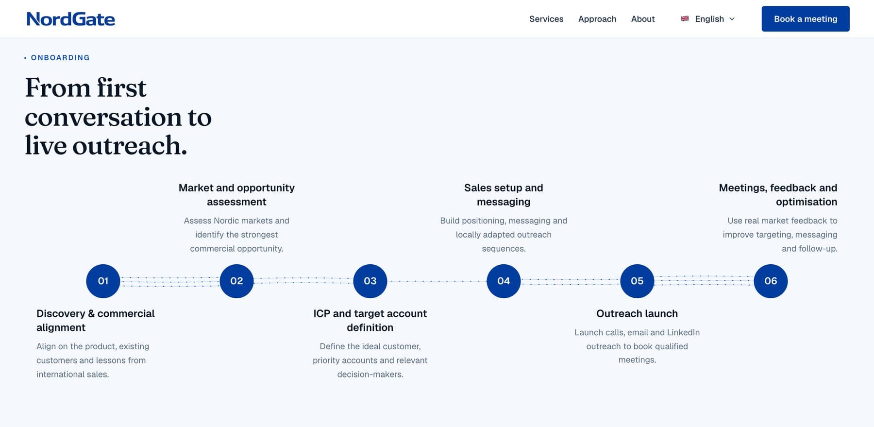
Editorial serif headlines set the tone. Services, steps and navigation stay in a plain sans so they read quickly.
Structure ready for more than one language
Language switching is part of the site structure, because the audience is spread across several countries.
The work